


Pyramid charts, unlike typical horizontal bar graphs or pie charts, offer a unique way of conveying information. As interesting as their structures are, their origins and utility are even more fascinating. To understand more about their structure and utility, it’s best to ask, what are pyramid charts? Keep reading to explore the world of pyramid charts in depth.
Table of Contents
Unveiling the Concept of Pyramid Charts
At a fundamental level, pyramid charts are a visual representation of data, often used for demonstrating hierarchical structures or proportional relationships. The pyramid itself is divided into segments, each representing a different component of the data set.
At first glance, pyramid charts might seem similar to bar graphs. However, what makes them unique and visually striking is their three-dimensional, triangular representation.
Moreover, pyramid charts are ideal for displaying data that needs to be segregated into different levels. They can perfectly represent hierarchical orders, different stages of a process, or several parts of a whole entity.
Bottom line, a pyramid chart is a versatile tool in data visualization, which can make complex data understandable at a single glance while being visually engaging at the same time.
Breaking Down the Structure of Pyramid Charts
The structure of a pyramid chart resembles a pyramid, being triangular and three-dimensional. As mentioned before, it’s divided into segments or levels, each of which represents a different piece of information.
A typical pyramid chart is divided from top to bottom. The higher segments are smaller and represent the high-priority or significant aspects of the data. As you move down the pyramid, the segments become broader, representing less crucial information or greater numbers.
The segments of the pyramid can vary based on the information you wish to impart. For example, if you’re illustrating the hierarchy of a company, the president or CEO would sit at the top, followed by upper management, middle management, and employees.
The versatility of the pyramid structure allows the data to be understood quickly and effortlessly, making pyramid charts an indispensable tool for displaying multi-faceted information.
Real-World Application of Pyramid Charts
One common real-world application of pyramid charts is in business, where they’re often used to demonstrate company hierarchies or project priorities. They also help in illustrating the distribution of resources and segregation of target markets.
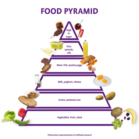
Another real-world application of a pyramid chart is in health and nutrition. The food pyramid, for instance, is a popular example, which shows the hierarchy of nutrients that should be included in a balanced diet.
These wide-ranging applications of pyramid charts further highlight their importance in various sectors of society, reinforcing their value in data visualization.
Decoding the Significance of Pyramid Charts
The significance of pyramid charts can’t be overstated. Their ability to visually break down hierarchical systems or multi-level processes has made them invaluable in fields like business analytics, education, or systematic studies.
Moreover, their engaging visual presentation can help simplify complex concepts, making them more accessible to various audiences. It’s a powerful tool that can communicate a vast amount of data quickly and efficiently.
Importantly, pyramid charts enable effective decision-making, as they provide a holistic view of a situation or problem. Be it understanding a company’s resource allocation, laying out a project’s timeline, or planning a marketing strategy, pyramid charts light the way.
In conclusion, pyramid charts are a dynamic tool in data visualization. Their structure offers a novel way of looking at both hierarchical relationships and proportionality. Indeed, understanding pyramid charts opens a brand new dimension to data representation.