


You probably think of the homepage, blog, or product pages when you imagine outstanding website design. But what about the Contact Us page? In terms of text and design, far too many website designers place contact pages towards the bottom of their priority list.
It’s a pity, because a smart contact form design may do wonders for your business. According to statistics, it accounts for 74% of all lead generation. Furthermore, it is one of the most important instruments for communicating with potential clients and conducting marketing efforts.
We’ve gathered a collection of unique contact form examples for your inspiration in this article.
Table of Contents
What Exactly is a Contact Form?
Contact forms are just submittable forms installed on your website that allow people to contact you. Customers may simply communicate with you by entering their information, queries, or comments into a contact form. They allow your company to quickly communicate with everyone who views your website.
For example, they may ask for the basic minimum, such as the person’s name and email address. Alternatively, the form may ask more in-depth inquiries about what the consumer is searching for.
How to Create an Engaging Contact Form?
There are several approaches to contact form design. Of course, you’ll want your contact form design to be attractive and modern. It should be well-organized and follow a logical flow. One way is to keep your contact form simple by using only a few fields. You may also go deeper with your consumer by asking them extra questions.
You don’t want to have too many fields that the customer becomes discouraged. But it doesn’t imply you shouldn’t add fields if they make sense. The idea is to gather just enough knowledge to accelerate your ultimate goal. It’s also a good idea to avoid cluttering the form with unnecessary words or pictures.
The contact form should also be easily accessible. Some websites even have a “contact us” page in the navigation bar. This suggests that a customer can rapidly retrieve your contact details and form.
Tips to Design Creative Contact Forms
A well-thought-out online form design is what connects the cold computer interface to humans. It underpins so many things that doing it wrong can easily damage everything. As a result, it should be properly cared for. Follow these recommended practices to produce a user-friendly contact form design:
- Add a clear title and description to the top of the page.
- Colors should be used with prudence. Although red is the most effective color, it is also frequently associated with errors. Make use of neutral or brand colors.
- Make a gap between the fields. No one loves contact form designs that are overly crowded.
- Fill in the blanks with the needed information.
- Separate the major and secondary buttons.
- Make the submit button stand out from the rest of the buttons. Use time-tested hues like green and blue that readily recognize the component’s identity and are widely linked with the firm.
- Choose left-aligned forms over centric or right-aligned ones.
- Find your contact form’s sweet spot. Choose mundane locations since your users will check them first.
- Avoid using extensive drop-down menus.
- Separate the information into logical groups.
- Be cautious in your approach. You can be imaginative, but the routine should be simple.
- Use iPhone and Android-friendly components such as swipeable lists.
- Use the device orientation to make the most of the available screen area.
- Add voice-driven input support.
- Customize your “Thank You” page.
- Perform user testing. Adjust your form to match the current needs of your audience.
Best Contact Form Examples
Having familiarized yourself with the optimal tips, let’s examine some practical contact form designs for your inspiration.
-
Stripe
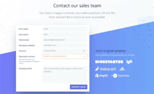
Stripe’s sales contact form is an excellent illustration of how gathering a little additional information may help your contact forms create more quality leads. Stripe adds a Payments volume feature to the normal information fields so that they can better determine the prospective quality of each lead.
2. Kinsta
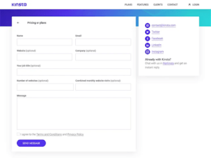
Kinsta features a single “Contact Us” page that directs users to the appropriate contact form without forcing them to reload the page.
When a user selects a goal, Kinsta presents either a customized contact form or a message. This enables Kinsta to capture only the information they want without overwhelming users with too many fields.
Kinsta, for example, provides more questions to the Pricing or Plans contact form to understand how many websites and visitors the user is seeking to host, but such information does not display on the “Anything else” form.
3. Choice Screening
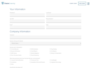
Choice Screening’s contact form is lengthy. At first sight, you would believe it will have a negative impact on the form’s conversion rates. That is partially correct — Choice Screening will almost certainly receive fewer form submissions than they would with a shorter form.
Choice Screening works in a highly specialized, business-to-business market. They want qualified leads who will become long-term clients, not merely contact form inputs.
The form’s thorough services list and several checkboxes will screen out those who aren’t sure what they want yet, allowing only qualified leads who are likely to become customers to get through.
4.Neil Patel
This one is basic, but sometimes simplicity is all that is required in contact form design. Neil includes an “I’d like to chat about” drop-down where individuals may select from a pre-set selection of ideas to assist route their submissions to the correct location. He also employs microcopy in the placeholder box to request that individuals keep their words brief and to the point.
5.Focus Lab
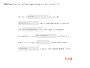
Instead of creating a standard form, Focus Lab implements a Mad Libs-like method where visitors input their details into a pre existing text. Focus Lab is also able to collect additional information (such as objectives and budget) without the overpowering appearance that a more standard contact form design would have.
Conclusion
Too many firms ignore their contact forms, wasting a key lead generation opportunity. The examples in this article show how you can make your contact pages and forms work for your company, boosting both the amount and quality of inquiries.
Every firm, regardless of sector or buyer personas, should strive for an excellent Contact Us page. A well-thought-out contact page allows you to keep a professional appearance while also making it simple to communicate with your audience in order to develop a good, long-term relationship.
We hope that our tips and tricks guide, as well as the collection of contact form examples, will assist you in improving your web form design in order to create traffic and increase income.